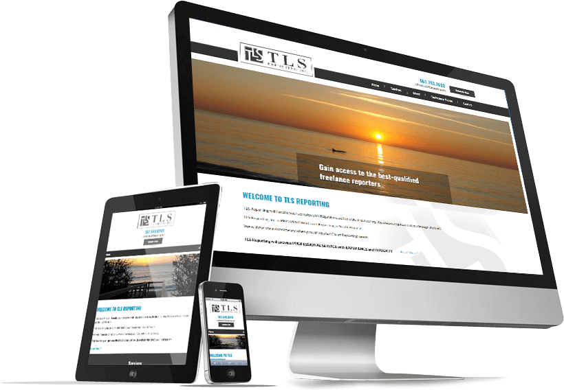
With the number of mobile devices constantly on the rise, it's difficult to ensure that your website appears correctly from desktop to laptop to iPad to smartphone…you get the picture. Ideally, you would create separate websites to fit each of the main screen sizes in use. As you can imagine, having several websites to maintain can be a recipe for confusion and stress. Quite the opposite of efficient.
ENTER: Responsive Web Design. RWD is a type of website that automatically adjusts to the screen your website is being viewed on. In other words, an RWD website that's full of photos and text may look great on a desktop screen. Then, when viewed on a smartphone, the site automatically adjusts to leave out unnecessary photos and text, display a navigation menu with larger buttons to make clicking easier, and generally update the layout for a user-friendly browsing experience. One website fits all.
RWD is gaining momentum…fast! Take that small extra step of creating an RWD website to ensure that your website looks good no matter where it's viewed.